

السلام عليكم ورحمة الله وبركاته
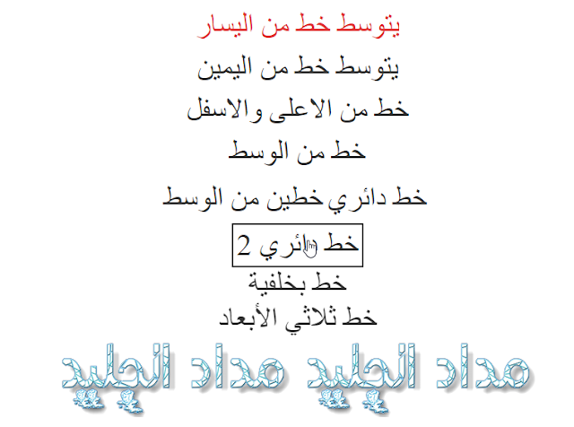
نقدم لكم مجموعة تأثيرات خاصة على الكلمات يمكن من خلالها جعل النصوص أو حتى الروابط أجمل في موقعك أو مدونتك
يمكن الحصول على كل كود الخاص بالتأثيرات أسفل كل معاينة
1. يتوسط خط من اليسار
a.izdadcha {
  position: relative;
  overflow: hidden;
  display: inline-block;
  text-decoration: none;
  color: #e23636;
  font-size: 40px;
  line-height: 46px;
  padding: 0 0 6px;
}

a.izdadcha:after {
  content: "";
  position: absolute;
  bottom: 0;
  left: -100%;
  width: 100%;
  height: 3px;
  background: #333;
  transition: left .8s;
}

a.izdadcha:hover:after {
  left: 0;
}
<a class="izdadcha" href="">يتوسط خط من اليسار</a>
a.dchaizda {
  position: relative;
  overflow: hidden;
  display: inline-block;
  text-decoration: none;
  color: #333;
  font-size: 40px;
  line-height: 46px;
  padding: 0 0 6px;
}

a.dchaizda:after {
  content: "";
  position: absolute;
  bottom: 0;
  right: -100%;
  width: 100%;
  height: 3px;
  background: #333;
  transition: right .8s;
}

a.dchaizda:hover:after {
  right: 0;
}
<a class="dchaizda" href="">يتوسط خط من اليمين</a>
a.dobleizdadcha {
  position: relative;
  overflow: hidden;
  display: inline-block;
  text-decoration: none;
  color: #333;
  font-size: 40px;
  line-height: 46px;
  padding: 0 0 6px;
}

a.dobleizdadcha:before,
a.dobleizdadcha:after {
  content: "";
  position: absolute;
  top: 0;
  left: -100%;
  width: 100%;
  height: 3px;
  background: #333;
  transition: left .8s;
}

a.dobleizdadcha:hover:before {
  left: 0;
}

a.dobleizdadcha:after {
  top: auto;
  bottom: 0;
  left: auto;
  right: -100%;
  background: #333;
  transition: right .8s;
}

a.dobleizdadcha:hover:after {
  right: 0;
}
<a class="dobleizdadcha" href="">خط من الاعلى والاسفل</a>
4. خط من الوسط
a.centro {
  display: inline-block;
  position: relative;
  color: #333;
  text-decoration: none;
  font-size: 40px;
  line-height: 46px;
  padding: 0 0 6px;
}

a.centro:after {
  content: "";
  display: block;
  margin: auto;
  height: 3px;
  width: 0px;
  transition: all .8s;
}

a.centro:hover:after {
  width: 100%;
  background: #333;
}
<a class="centro" href="">خط من الوسط</a>
a.doblecentro {
  display: inline-block;
  position: relative;
  color: #333;
  text-decoration: none;
  font-size: 40px;
  line-height: 46px;
  padding: 0 0 6px;
}

a.doblecentro:before,
a.doblecentro:after {
  content: "";
  display: block;
  margin: auto;
  height: 3px;
  width: 0px;
  background: #333;
  transition: all .8s;
}

a.doblecentro:hover:before,
a.doblecentro:hover:after {
  width: 100%;
}
<a class="doblecentro" href="">خطين من الوسط</a>
6. خط دائري
a.caja {
  display: inline-block;
  position: relative;
  color: #333;
  text-decoration: none;
  font-size: 40px;
  line-height: 46px;
  padding: 6px;
}

a.caja:before,
a.caja:after {
  content: "";
  width: 100%;
  height: 100%;
  position: absolute;
  top: 0;
  left: 0;
  box-sizing: border-box;
  transform: scale(0);
  transition: 0.5s;
}

.caja:before {
  border-bottom: 2px solid #333;
  border-left: 2px solid #333;
  transform-origin: 0 100%;
}

.caja:after {
  border-top: 2px solid #333;
  border-right: 2px solid #333;
  transform-origin: 100% 0%;
}

.caja:hover:after,
.caja:hover:before {
  transform: scale(1);
}
<a class="caja" href="">خط دائري</a>
7. خط دائري 2
a.caja2 {
  display: inline-block;
  position: relative;
  color: #333;
  text-decoration: none;
  font-size: 40px;
  line-height: 46px;
  padding: 6px;
}

a.caja2:before,
a.caja2:after {
  content: "";
  width: 100%;
  height: 2px;
  position: absolute;
  box-sizing: border-box;
  transform: scale(0);
}

.caja2:before {
  transform: translateX(100%);
  bottom: 0;
  left: 0;
  height: 2px;
  border-bottom: 2px solid transparent;
  border-left: 2px solid transparent;
  transition: .1s transform linear, .1s height linear .1s;
}

.caja2:after {
  transform: translateX(-100%);
  top: 0;
  left: 0;
  height: 2px;
  border-top: 2px solid transparent;
  border-right: 2px solid transparent;
  transition: .1s transform linear .2s, .1s height linear .3s;
}

.caja2:hover:after,
.caja2:hover:before {
  transform: translateX(0);
  height: 100%;
  border-color: #333;
}
<a class="caja2" href="">خط دائري 2</a>
8. خط بخلفية
a.centrofondo {
  position: relative;
  text-decoration: none;
  color: #333;
  z-index: 1;
  font-size: 40px;
  line-height: 46px;
  padding: 3px 0;
}

a.centrofondo:before {
  content: "";
  background: #ccc;
  position: absolute;
  width: 100%;
  height: 3px;
  bottom: 0;
  left: 0;
  transform: scaleX(0);
  animation: .8s no-hover;
  animation-fill-mode: forwards;
  z-index: -1;
}

a.centrofondo:hover:before,
a.centrofondo:focus:before {
  animation: .4s hover linear;
  animation-fill-mode: forwards;
}

@keyframes hover {
  0% {
    transform: scaleX(0);
    height: 5px;
  }
  45% {
    transform: scaleX(1.05);
    height: 5px;
  }
  55% {
    height: 5px;
  }
  100% {
    transform: scaleX(1.05);
    height: 2.8rem;
  }
}

@keyframes no-hover {
  0% {
    transform: scaleX(1.05);
    height: 2.8rem;
  }
  45% {
    height: 5px;
  }
  55% {
    transform: scaleX(1.05);
    height: 5px;
    opacity: 1;
  }
  100% {
    transform: scaleX(0);
    height: 5px;
    opacity: .02;
  }
}
<a class="centrofondo" href="">خط بخلفية</a>
a.tresd {
  display: inline-block;
  position: relative;
  color: #333;
  text-decoration: none;
  font-size: 40px;
  line-height: 46px;
  transition: all .5s ease;
  transform-style: preserve-3d;
}

a.tresd:after {
  content: "ثلاثي الابعاد";
  position: absolute;
  top: -100%;
  left: 0px;
  width: 100%;
  background: #ccc;
  transform-origin: left bottom;
  transform: rotateX(90deg);
}

a.tresd:hover {
  transform-origin: center bottom;
  transform: rotateX(-90deg) translateY(100%);
}
<a class="tresd" href=""> خط ثلاثي الأبعاد</a>
كما يمكن إجراء هذه التأثيرات على الصور كما هو أدناه بوضع أي رمز من الشكل المطلوب أعلاه للصورة
10. 
<a class="caja" href="#"><img src="http://madad2.com/wp-content/uploads/2017/04/c88a07e78fe.png" class="wp-image-7716"/></a>
<a class="caja2" href="#"><img src="http://madad2.com/wp-content/uploads/2017/04/c88a07e78fe.png" class="wp-image-7716"/></a>
لاحظ في الكود أعلاه أضفنا فقط للصورة معرف الكود caja2 والثانية caja كما يمكن إضافة اي معرف للصور لتظهر بالشكل المطلوب
طبعا يمكن تغيير القيمة الخاصة ب CSS إلى اي قيمة أخرى على سبيل المثال تريد جعل روابط الموضوع تظهر على شكل رابط بالخلفية سوف نقوم بالتعديل على الكود “خط بخلفية” بالشكل التالي:
.post-body a {
  position: relative;
  text-decoration: none;
  color: #333;
  z-index: 1;
  font-size: 40px;
  line-height: 46px;
  padding: 3px 0;
}

.post-body a:before {
  content: "";
  background: #ccc;
  position: absolute;
  width: 100%;
  height: 3px;
  bottom: 0;
  left: 0;
  transform: scaleX(0);
  animation: .8s no-hover;
  animation-fill-mode: forwards;
  z-index: -1;
}

.post-body a:hover:before,
.post-body a:focus:before {
  animation: .4s hover linear;
  animation-fill-mode: forwards;
}

@keyframes hover {
  0% {
    transform: scaleX(0);
    height: 5px;
  }
  45% {
    transform: scaleX(1.05);
    height: 5px;
  }
  55% {
    height: 5px;
  }
  100% {
    transform: scaleX(1.05);
    height: 2.8rem;
  }
}

@keyframes no-hover {
  0% {
    transform: scaleX(1.05);
    height: 2.8rem;
  }
  45% {
    height: 5px;
  }
  55% {
    transform: scaleX(1.05);
    height: 5px;
    opacity: 1;
  }
  100% {
    transform: scaleX(0);
    height: 5px;
    opacity: .02;
  }
}
شاهد الفرق بين الكود الذي عدلت عليه والكود الخاص بالرابط بالخلفية لقد قمت بإستبدال معرف الكود “centrofondo.” بالمعرف الخاص بالنص في داخل الموضوع “post-body.” بحيث سوف تعمل فقط داخل الموضوع وهكذا يمكن أختيار أي كود وتضمينه مباشر في مدونتك مثلا فوق الرمز ]]></b:skin> وإجراء التعديلات المذكورة في هذا النص لأي شيء في الموقع او في المدونة فقط غير معرف الكود الذي أخترته إلى معرف الروابط او الصور التي تريد ان تظهر بالشكل المطلوب
يمكن التعديل على الأكواد جميعها من خلال التحكم باللون مثلاً color: #333; أو حجم النص font-size: 40px; وإذا كنت بحاجة إلى المساعدة في هذا الموضوع لا تتردد في ترك تعليق.
يمكنك إضافتها مباشرة من خلال الموضوع عبر النقر على html واضافة الكود الكامل الخاص بالتأثير المطلوب على سبيل المثال:
<a class="tresd" href=""> خط ثلاثي الأبعاد</a>
<style>
a.tresd {
display: inline-block;
position: relative;
color: #333;
text-decoration: none;
font-size: 40px;
line-height: 46px;
transition: all .5s ease;
transform-style: preserve-3d;
}
a.tresd:after {
content: "ثلاثي الابعاد";
position: absolute;
top: -100%;
left: 0px;
width: 100%;
background: #ccc;
transform-origin: left bottom;
transform: rotateX(90deg);
}
a.tresd:hover {
transform-origin: center bottom;
transform: rotateX(-90deg) translateY(100%);
}
</style>
او يمكن اضافة اي كود css من النصوص المطلوبة بشكل دائم فوق الرمز ]]></b:skin> في المظهر ثم استخدام الكود
<a class="tresd" href=""> خط ثلاثي الأبعاد</a>
في المواضيع عبر النقر على html في مسودة الموضيع